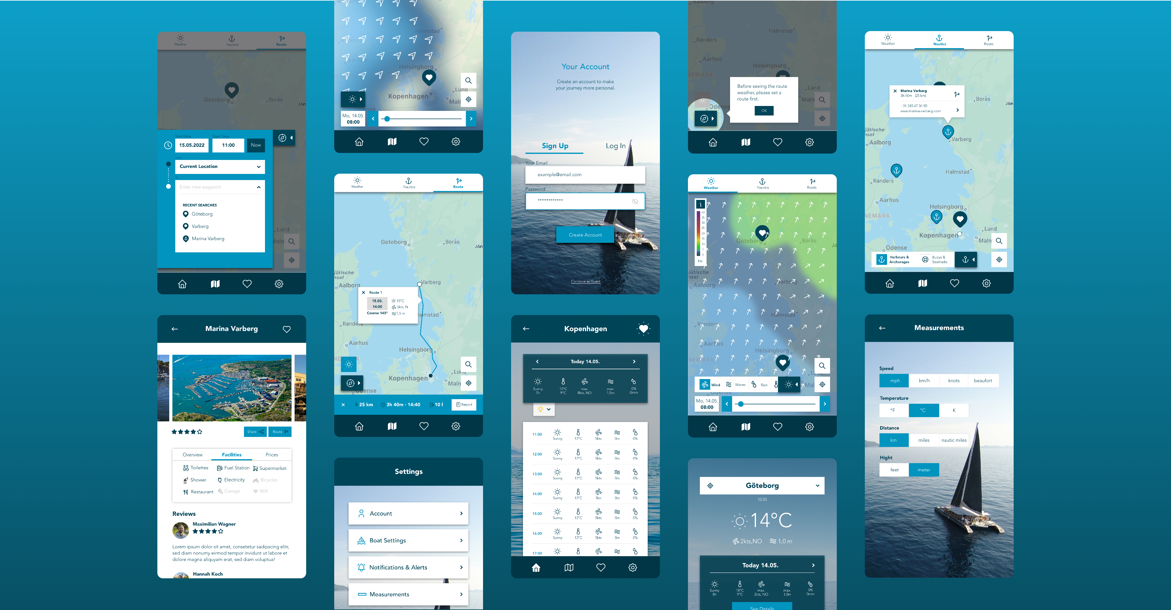
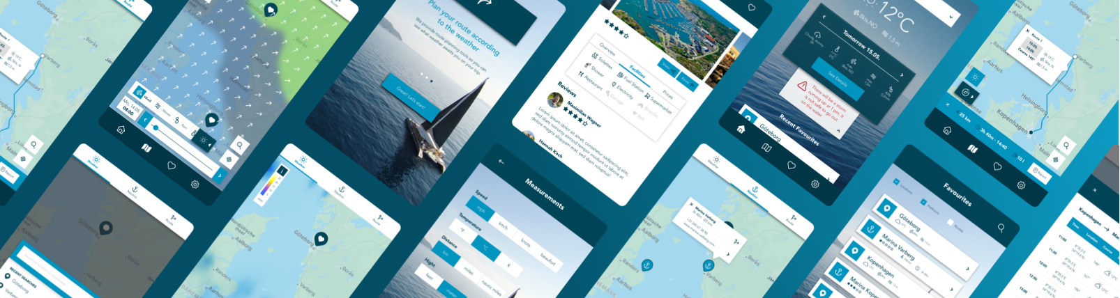
Zurück zur Startseite

VELA App

UX Case Study

Sorry, diese Seite gibt es bisher nur auf Englisch. Ich arbeite aber an der Übersetzung!

icon Problem

The Problem

Days on the water are not supposed to be stressful. That’s why it’s good to check weather conditions to better prepare for a day of sailing. Existing weather apps aren’t meeting the goal of displaying complex weather data in an easy-to-comprehend way.

icon Role

The Solution

VELA is an app dedicated to sailors from all expert levels, that helps them prepare for their sailing trips with intuitively designed and easy to understand weather forecasts combined with basic navigation and routing tools.

icon puzzle

My Role

I was involved in everything from research, creating wireframes and prototypes, usability testing all the way to the final UI design. This project was part of my UX Design Course at Career Foundry.

Research Phase

Competitive Analysis

In order to better understand the sailing and weather report industry and find out where my product currently fit within the market I conducted a competitor analysis. I focused on two weather apps: Windy and Windfinder. Content of the analysis were an overall marketing profile, a SWOT analysis and a thorough UX analysis.

User Interviews

In order to better understand the sailing and weather report industry and find out where my product currently fit within the market I conducted a competitor analysis. I focused on two weather apps: Windy and Windfinder. Content of the analysis were an overall marketing profile, a SWOT analysis and a thorough UX analysis.

Research Goals

  1. Better understand user behaviour around the activity of sailing
  2. Determine which tasks users would like to complete using a sailing app
  3. Find out about pain points when preparing for a cruise

Affinity Mapping

In order to explore the data from the interviews and uncover an findings and gain valuable insights, I created an affinity map that revealed patterns I could focus on:

Key Insights from Interviews

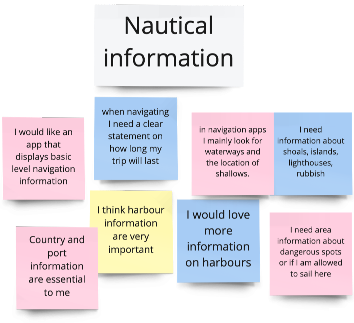
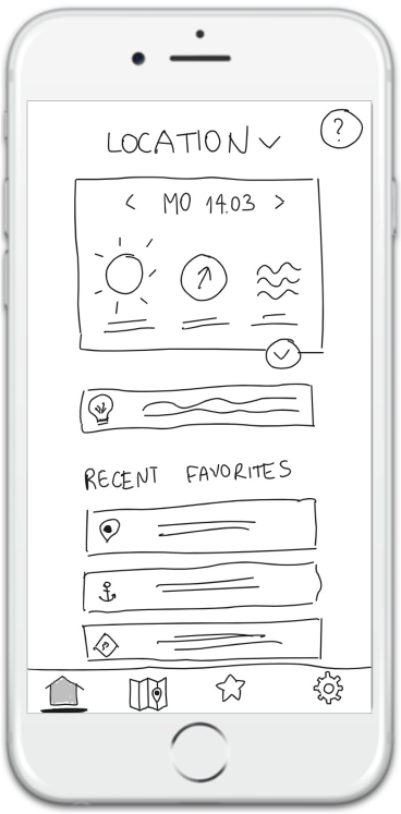
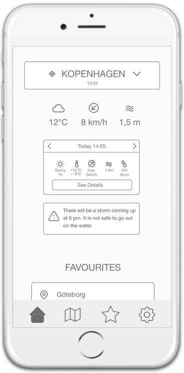
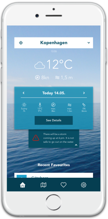
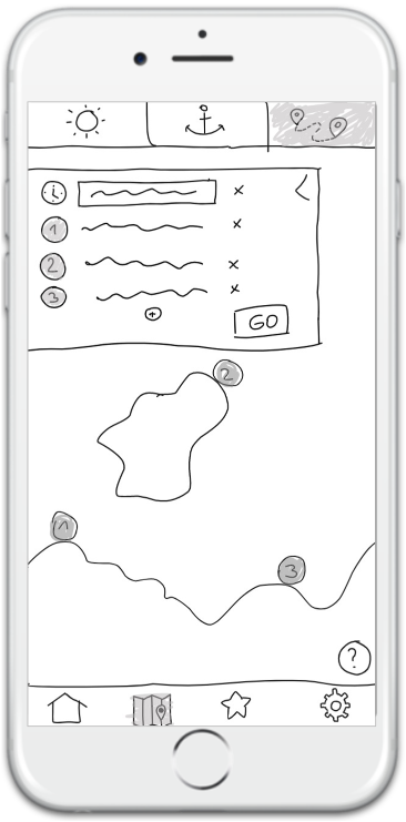
No app that combines 2 main sailor’s tasks: weather information & navigation.

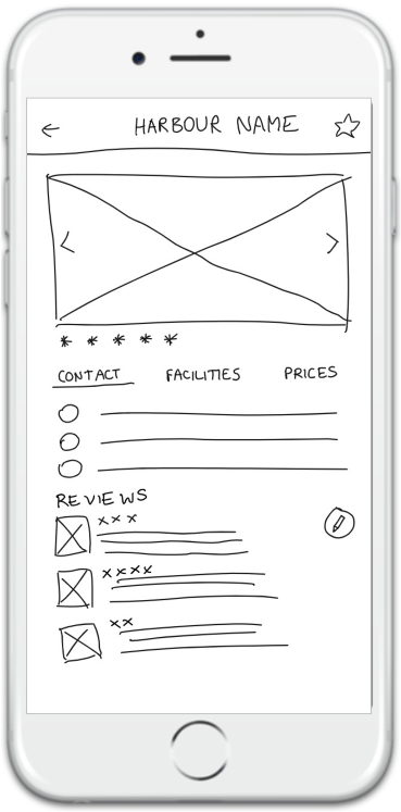
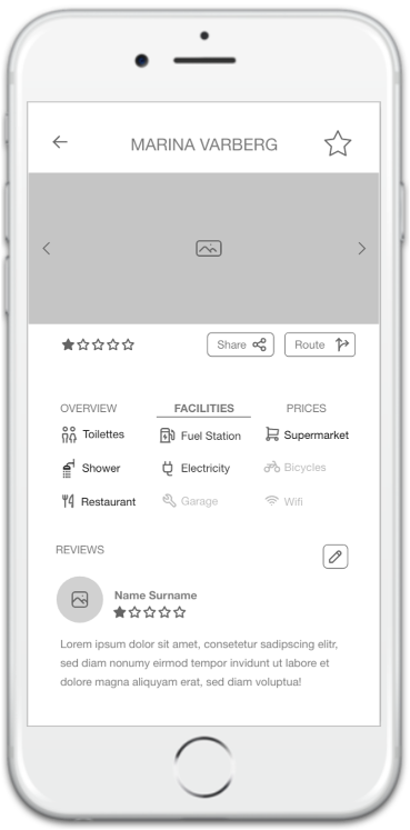
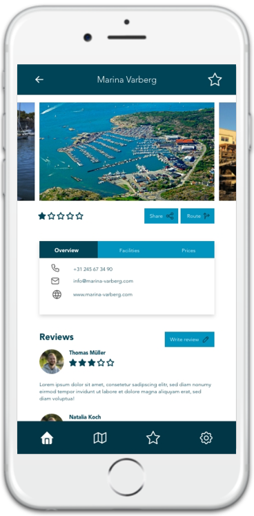
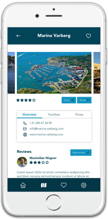
Harbours and their contact information are crucial and would be highly appreciated.

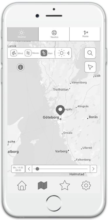
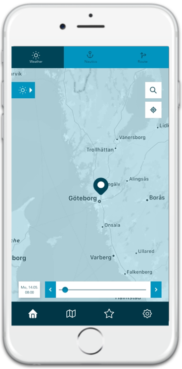
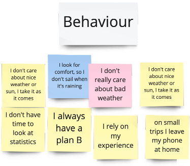
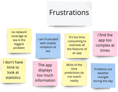
Most weather apps are highly complex and display too many parameters.

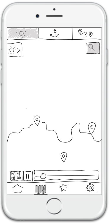
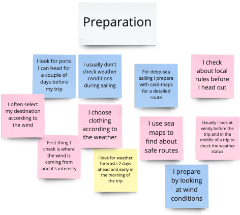
Weather preparation for sailing is done with maps, not data.
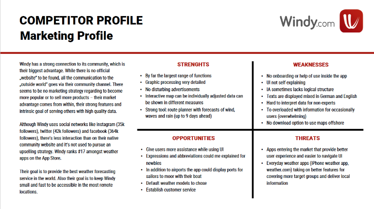
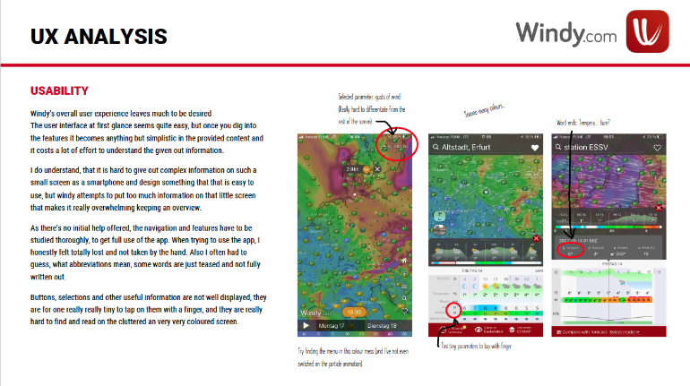
Concept Phase

Personas

With the outcome of the user research, the foundation, I created two personas that made potential users of my app come to life with their goals, needs and pain points in mind. These deliverables helped to keep the end user in the forefront of the design process. Meet Thomas and Hannah.

User Journeys

Time to send Thomas and Hannah on a journey through the app. Based on their characteristics I thought about possible scenarios they might face and dealt with their emotions and thoughts along their task to help me understand their respective needs.

User Flows

With user flows I depicted the physical journey of our personas through the app, based on their tasks they have to complete in order to reach their respective goal.

Information Architecture

In order to keep the information architecture user-centred at all times throughout the design process, I conducted a card sorting with various participants. Those sessions gave me valuable insights about my users’ mindsets. See here the final sitemap.

Test & Iteration Phase

Low to High Fidelity Wireframes

With a solid sitemap as a basis I continued with creating wireframes for various flows. I started by sketching low fidelity versions with Miro and went through several iterations based on multiple rounds of usability testing, following Accessibility Guidelines, Material Design Guidelines, A/B preference tests and feedback from other designers. This process helped me to keep things simple, throw away designs I didn’t like, figure out if the navigation works smoothly and test my initial hypothesis of easy-to-comprehend forecast visualisation.

Dashboard

Content creation based on user interview findings

Separate current location weather and overall weather after usability tests

Introducing background image after A/B preference test

Adjusted contrast and sizing according to Accessibility Guidelines

Weather Forecast

Weather forecast, nautical and route planning features combined

Current position added for better access, legend for weather data added

Design Language system was introduced, new icons for better understanding (nautical, location)

Icons got a label to avoid guessing, widgets are moved to the bottom for better access with thumb

Harbour Profile

Harbour information according to user needs

Harbour details curated after competitive analysis, share & route button added for better UX

Design Language system was introduced, overview now in tab container to group information

Top bar and tabs adjusted according to Material Design Guidelines, font size increased for better readability

Route PLanning

Route feature inspired by Google Maps mechanism

Usability Test revealed that users want current position as starting point, introduced „now“ as start time

Possibility to add waypoints added after user review

Font size increased for readability, all widgets moved to bottom for better accessibility with one hand

Usability Testing

Mid Fidelity Wireframes were connected to flows to create an interactive prototype and sent out to various participants to conduct moderated remote and in-person usability tests. A test script ensured to keep me on track with a schedule and all tasks that participants had to complete as well as follow-up questions for better evaluation.

Test Goals

This usability test aimed to evaluate the learnability of new users interacting with the app for the first time. I observed how easily users could complete basic tasks such as going through onboarding, seeing forecasts or plan routes. I also evaluated how intuitive and easy to understand the user flow is.

Please click the image to see the full test script.

Evaluation

The feedback of my participants was then analyzed and sorted by its value, again using an affinity map as well a rainbow spreadsheet. Those tools helped me evaluate the severity of the errors and which priority I should set on the revisions. Error severity was rated using the Jacob Nielsen Scale.

Deliverables

Design Language System

A comprehensive Design Language System was developed to provide everyone involved in the project with detailed aspects of colour, typo, elements and other parameters used to make sure the UX project is well documented and help developers understand the app’s concept.

Final UI

After multiple rounds of iteration the final screens were created, combining all results from the research, ideation and iteration phases. Also see the interactive prototype underneath.

Du willst mehr sehen?

Du willst auch ein umwerfendes Design?